Section Colors, Fonts and Backgrounds
Most Section Builder sections share the same drawer tabs for color, type and background, and the same layout settings. They work the same way in every section, so they are explained once here. Open any section's drawer with Modify on its toolbar.
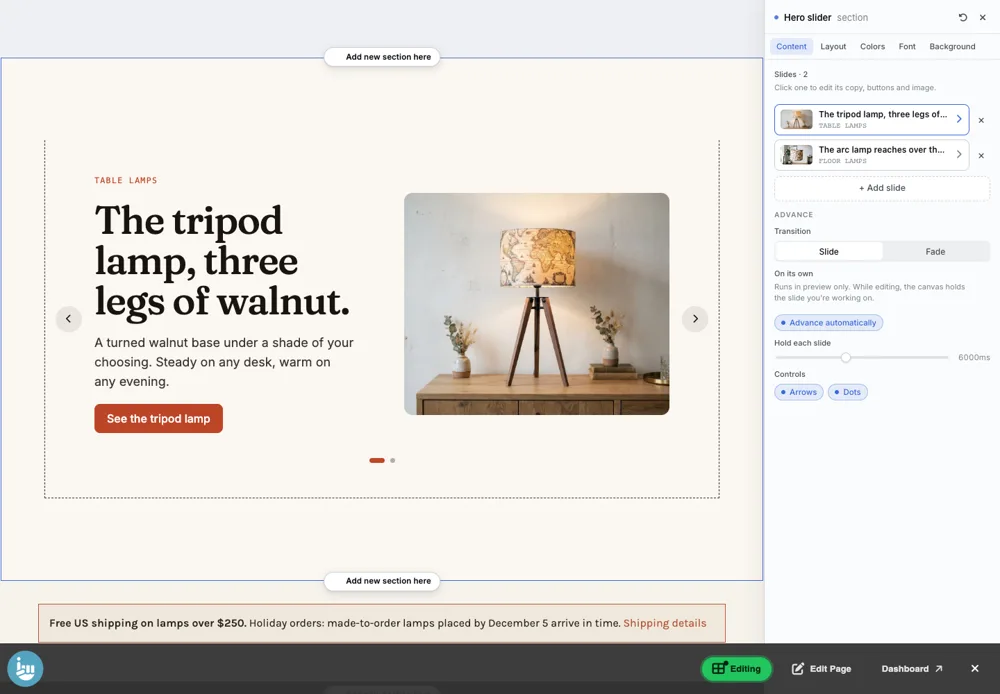
Colors
- Mode: Light or Dark.
- Theme library: 16 ready-made color themes: Clay, Forest, Indigo, Mono, Sand, Plum, Ocean, Rose, Paper, Mint, Noir, Citrus, Slate, Coral, Lavender and Graphite. Each comes in light and dark.
- Colors: change any single color of the theme: Title, Body text, Muted / caption, Accent, Button, Button text, Section background and Item background.
- Reset: goes back to the theme's own colors.

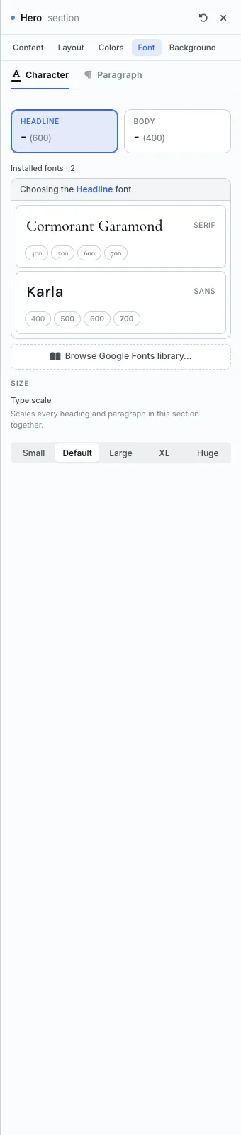
Font
- Headline and Body: choose which font each uses. Click one, then pick from your installed fonts.
- Browse Google Fonts library: add a new font to your shop.
- Type scale: Small, Default, Large, XL or Huge. Scales every heading and paragraph in the section together.
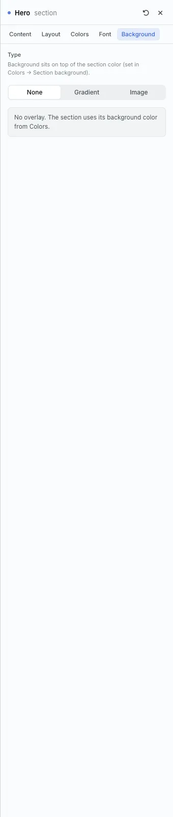
Background
- None: the section uses its background color from the Colors tab.
- Gradient: a blend of colors.
- Image: a photo behind the section.
- A background sits on top of the section color.
Layout settings most sections share
- Container width: Narrow, Standard, Wide or Full. How wide the section's content runs.
- Density: Compact, Cozy or Spacious. Sets the section's padding, gaps and rhythm in one go.
- Advanced spacing: open it to set the padding on each side yourself.
- Each section's own layout settings are on its page below.
Every section
- Hero
- Hero slider
- Hero Banner
- Slideshow
- Section heading
- Split
- Card grid
- Rich text
- Banner
- Media strip
- Gallery
- Collage
- Featured Products
- Category Cards
- Reviews
- Blog
- Video
- Video grid
- Custom
Building Pages with the Section Builder · Questions? Email support@indiemade.com.