Adding Sections to Your Pages
The Section Builder puts designed sections on the pages of your site: a hero, a gallery, a row of products, a video. Pick a section, click on its words to type, and shape it in a side drawer: layout, colors, fonts and background. It comes with every plan.
Pages and sections: how they fit together
A page is a page of your site with its own address, like /about or /faq. You make one under Dashboard → Pages → Add Page, with a title, a body, a menu link and its search settings; see Adding a Page. A section is a designed block that sits on a page.
A page you make works one of two ways:
- A writing page: a title and a body you type in the editor, like a FAQ or a shipping policy. You can still add sections above or below the writing. Examples: FAQ and Shipping & Returns on our demo shop.
- A sections page: tick Build this page with Section Manager on Add Page. The title and body are hidden and the page is made entirely of sections, the way a homepage or a landing page usually is. Examples: the demo shop's Home, About and Workshop pages.
Sections are not only for pages you make. You can add them above or below the products on your store, category and product pages too: a strip of reassurances above a category, a banner under a product. And one section can show on many pages at once, such as a sale banner on every page.
Adding a section
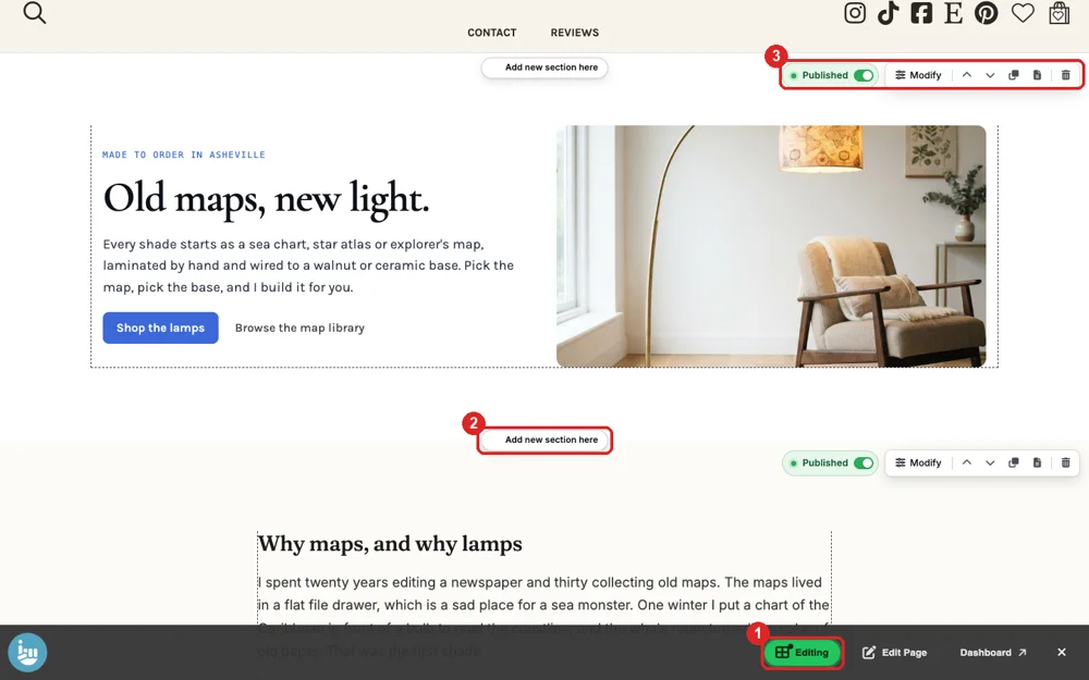
- Sign in, open any page of your site, and click Editor (1) in the toolbar at the bottom of the window.
- Click Add new section here (2) where you want it, pick a section and click Add section.
- Click its words and type. Replace the sample pictures with your own.
- Click Modify on the section's toolbar (3) to open its drawer.
The section toolbar
Point at a section to see its toolbar: Published shows or hides it, Modify opens the drawer, the arrows move it, and the other buttons copy it, choose the pages it shows on (one page, every page, or pages you pick) and delete it.
The drawer
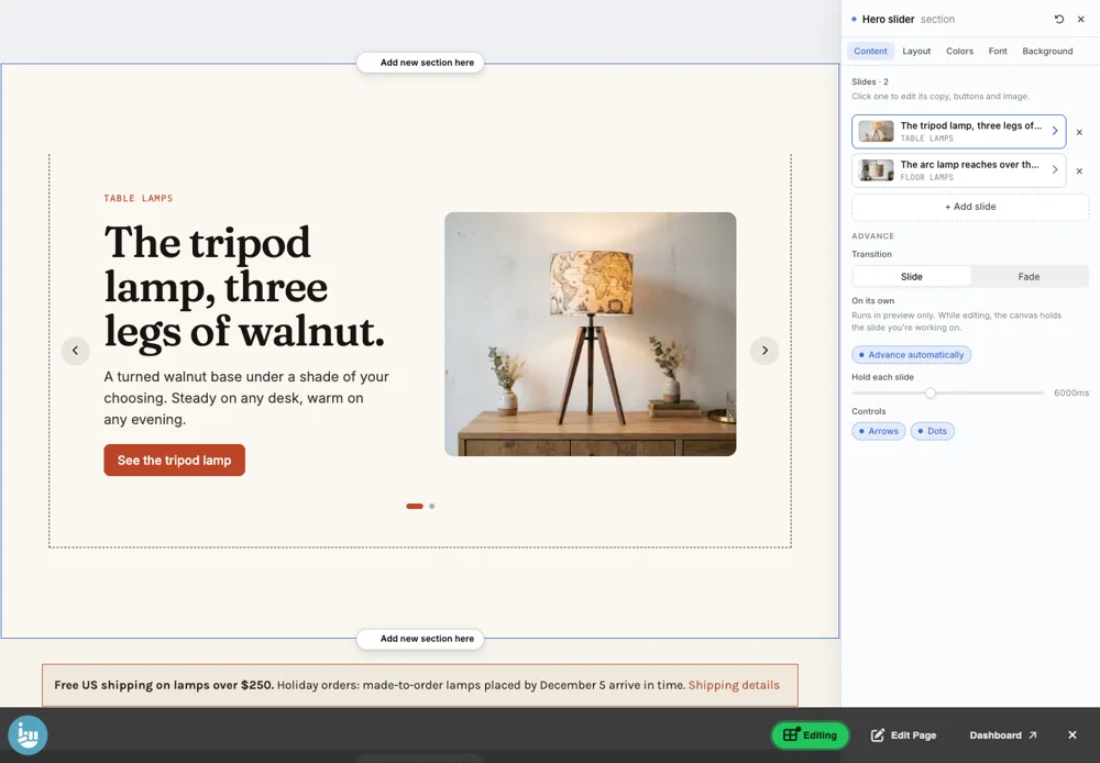
The drawer has up to five tabs: Content (what is in the section), Layout (how it is arranged), and Colors, Font and Background, which work the same in every section; see Section Colors, Fonts and Backgrounds.
The 19 sections
Each has its own page with every setting, pictures, and a link to see it live.
Openers
- Hero: Headline, text, two buttons and a photo, for the top of a page.
- Hero slider: Several Heroes that take turns, each slide its own color.
- Hero Banner: One big picture, nothing else.
- Slideshow: Full-width photos with the words laid over them.
Words and pictures
- Section heading: A short title to introduce what comes next.
- Split: A photo or video beside a title, text and a link.
- Card grid: A grid of cards with a picture, title and button.
- Rich text: Long writing in one reading column.
- Banner: A short message with one or two buttons.
- Media strip: A thin band of logos or names.
Photos
- Gallery: Photos at their own shapes, side by side.
- Collage: A hand-arranged pile of photos and notes.
From your shop
- Featured Products: Real products from your shop, always current.
- Category Cards: Your categories as clickable cards.
- Reviews: Product reviews, live from your shop.
- Blog: Your latest blog posts.
Video
- Video: One video, yours or from YouTube.
- Video grid: Several videos in a grid.
Build your own
- Custom: Describe what you want and it is built for you.
Video sections take YouTube links on every plan. Videos from your own library need Product Videos, part of the Plus plan.
Questions? Email support@indiemade.com.