Showing Choices as Buttons, Color Swatches or Image Swatches
A dropdown hides your choices until a shopper opens it. Buttons and swatches put them all on the page at once: every size as a button, every color as a little circle of paint, every fabric or map print as a tiny picture. Shoppers see what you make before they click, and one tap picks it. This works for your Variations (Size, Color and the like) and for your Options (gift wrap, a bulb, a finish). It is included on every plan, and nothing changes in your shop until you choose it.
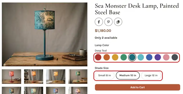
The four ways to show choices
- Dropdown: the usual select list. This is what every product has until you change it.
- Buttons: each choice is a button with its name on it. The best pick for sizes, and it needs nothing else from you.
- Color swatch: each choice is a circle of its color. A choice can have up to three colors, drawn as a diagonal split or slices, for heathers and two-tone work.
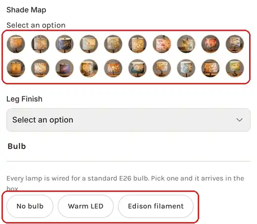
- Image swatch: each choice is a small picture, such as a fabric, a glaze or a print. You can upload a swatch picture, or let IndieMade cut the choice's photo down to size.
Showing a Variation as buttons or swatches
- Go to Dashboard → Products and open the product. (For a shared Variation Template, open it from Dashboard → Variations instead; the setting is the same and every product using it follows.)
- In the Variations box, find the variation, such as Color.
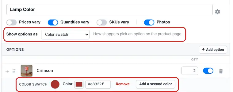
- Change Show options as to Buttons, Color swatch or Image swatch.
- For a color swatch, each option now has a Color swatch row. Click the Color square to pick a color, or type a hex code such as #1f6a78. Click Add a second color (and then Add a third color) for a two-tone or three-tone swatch.
- For an image swatch, click Upload swatch on each option and choose a small square picture. If the option already has its own photo, the editor says Using the option photo and you can skip it.
- Click Save.
Changing how options look never changes your prices, stock or SKUs, and never asks you to click Update Products.
Showing an Option as buttons or swatches
Options with a list of choices (Select List, Radio Select and Checkboxes) have the same setting, called Show choices as. Open the product, or the option template under Dashboard → Options, and change it to Buttons, Color swatch or Image swatch. A Checkboxes option stays a pick-several option: shoppers can press more than one button.
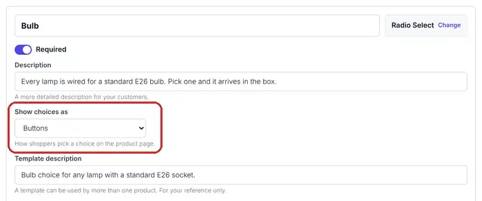
For a choice with an extra charge, the button shows the choice's name and the price on the page goes up as soon as the shopper taps it.
The shape of the buttons
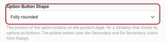
Open any product page on your shop while signed in, click the Settings gear in the bottom toolbar, and under Layout choose Option Button Shape: Fully rounded (the default), Slightly rounded or Square. Click Save. It changes every button on every product.
What shoppers see
- The picked choice gets a strong outline in your shop's Secondary color from Design, so it stands out on any background.
- The picked choice's name shows above a swatch row, so a shopper knows that teal circle is called Deep Teal.
- A sold-out choice is dimmed, not hidden, and stays dimmed while the shopper tries other choices. To hide sold-out choices instead, use Hide out-of-stock variations in the same Settings gear.
- If the option has a photo, the product photo switches to it when the shopper picks it. See Using the Upgraded Variations Editor for option photos.
- Each row of choices gets its own line, so Size and Color never squeeze side by side.
Tips
- Use Buttons for sizes and anything with words, Color swatch for paint, dye and glaze colors, and Image swatch for prints, fabrics and patterns that a color cannot show.
- Swatch pictures are shown small and cropped square, so crop close to the pattern. A 200 by 200 pixel picture is plenty.
- Keep a long list (twenty or more) of plain text choices as a dropdown. Twenty buttons is a lot of page.
- Selling on Etsy too? Swatches are only how your IndieMade shop draws the choices. Nothing changes on your Etsy listings.
Related: Using the Upgraded Variations Editor · Using the Options Editor · Variation Templates
Questions? Email support@indiemade.com.