The Card grid Section
A grid of cards, each with a picture, a title, a short description and an optional button.
Best for: Promises, services, collections, team members, or anything you want to show as a set.

On a phone
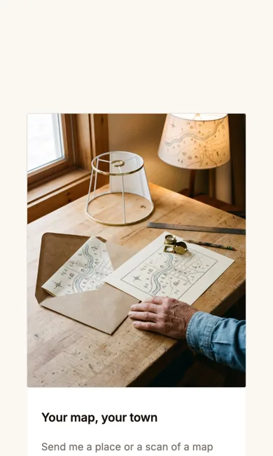
Adding it
Turn on the Editor, click Add new section here, and choose Card grid under Section Builder. It starts with sample words and pictures; replace them with your own. Click Modify on the section's toolbar to open its drawer. The steps, with pictures, are in Building Pages with the Section Builder.
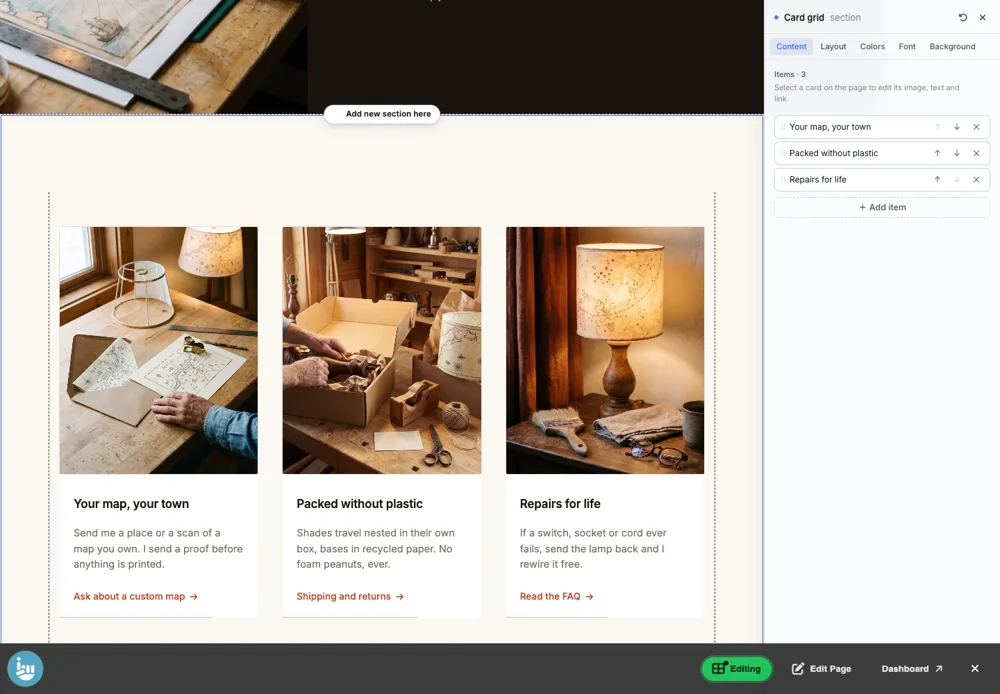
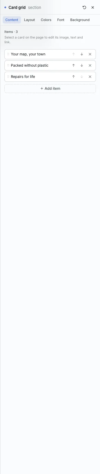
The Content tab
- Items: the cards in order. Use the arrows to move a card up or down, the cross to remove it, and + Add item to add one.
- To edit a card's picture, words and button, click the card itself on the page.
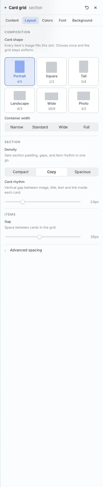
The Layout tab
- Card shape: every picture fills the same shape, so the grid stays even: Portrait (4/5), Square (1/1), Tall (3/4), Landscape (4/3), Wide (16/9) or Photo (3/2).
- Card rhythm: the space between the picture, title, text and button inside each card.
- Gap: the space between cards.
The settings every section shares are explained in Section Colors, Fonts and Backgrounds. Most sections also have Container width, Density and Advanced spacing.
Card grid also has the Colors, Font and Background tabs.
Tips
- Three or four cards in a row reads best. Need a heading? Put a Section heading above the grid.
All Section Builder sections · Questions? Email support@indiemade.com.