Sections & Layouts
Sections let you add custom content blocks to any page on your site. Use them to create hero images, feature highlights, image galleries, announcement bars, call-to-action banners, and more. Each section can have its own background color, background image, column layout, and styling.
Entering Edit Mode
Before you can add or edit sections, you need to enter Edit Mode. Look for the small pencil icon in the bottom toolbar of your site.
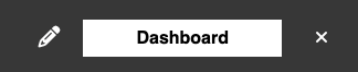
Click the pencil icon to toggle Edit Mode on. Once active, you will see editing controls appear on sections, and the Add New Section Here button becomes visible on your pages.
How Sections Work
Every page on your site has two section regions:
- Above Content — Sections placed here appear before the main page content. This is where hero images and top banners typically go.
- Below Content — Sections placed here appear after the main page content. Good for calls to action, related content, or footer-style sections.
You can add as many sections as you want to either region, and reorder them by moving sections up or down.
Adding a Section
- Make sure you are in Edit Mode (click the pencil icon in the bottom toolbar).
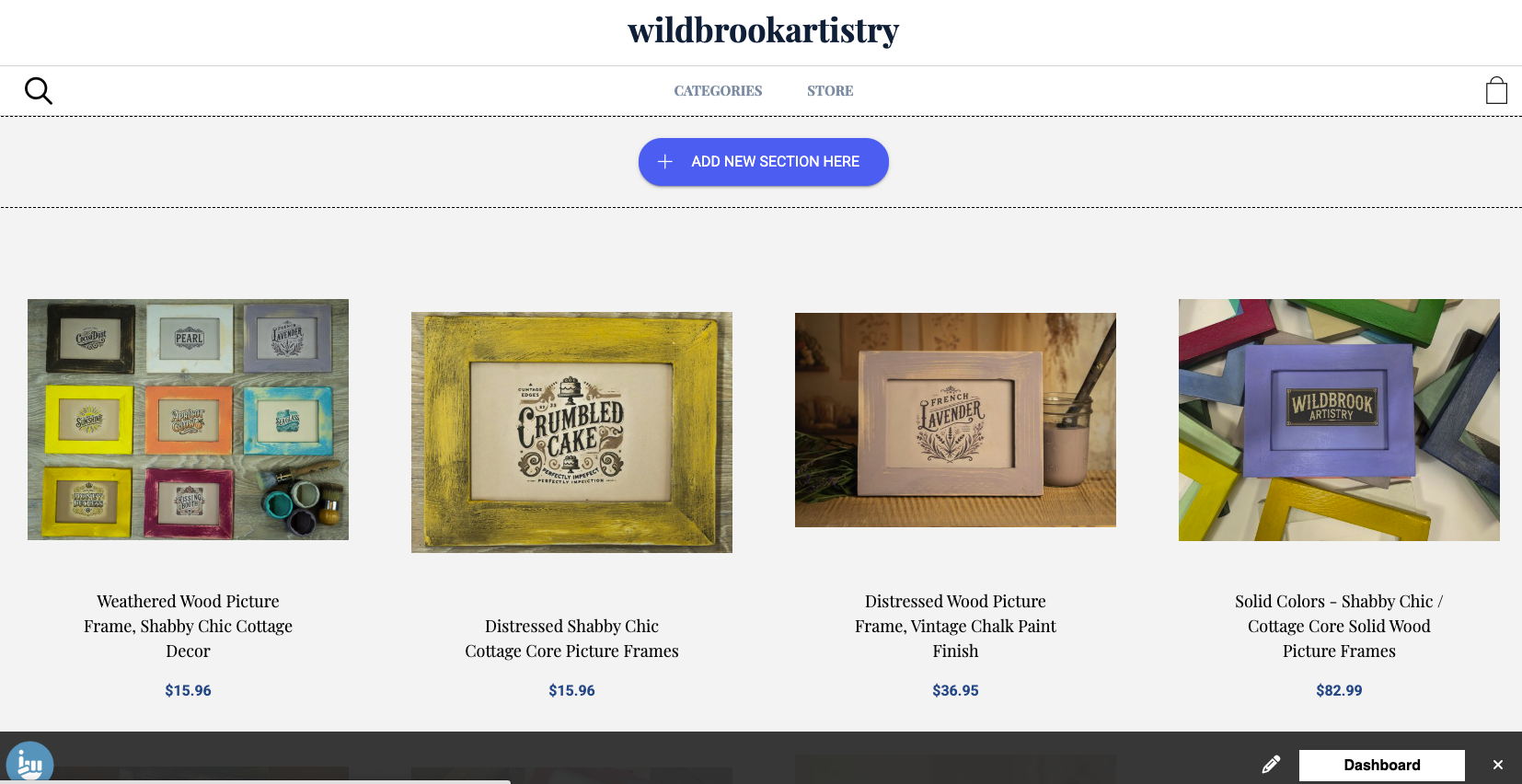
- Click the Add New Section Here button that appears on the page.
- Choose a section template from the available options. The template determines the section type and default layout.
- The section is created with placeholder content that you can immediately start editing.
Each section is made up of one or more items. Depending on the template, you may be able to add multiple items (for example, multiple images in a gallery or multiple feature cards in a column layout).
Section Templates
When you add a section, you choose from these templates. Each template comes pre-configured with a layout, column count, and placeholder content to get you started.
Standard Content
A single-column text section that matches your content width. Use it for articles, descriptions, or any text-heavy content. Supports full HTML formatting including bold, links, lists, and embedded media.
Hero Image
A full-width image that spans the entire page width. Ideal for large banner images at the top of a page. For best results, use images at least 1920 pixels wide. The image scales down responsively on smaller screens.
Slideshow
A full-width image slideshow that cycles through multiple images. Add as many slides as you need. Like the hero image, use images at least 1920 pixels wide for best quality.
Just Images
A four-column image gallery. Add multiple images that display in a grid. Great for showcasing products, portfolio pieces, or photo collections.
Feature Highlights
A three-column layout with a dark background for highlighting key features or selling points. Each column contains text content with a white background. Use this to showcase what makes your products or services special.
Left Image, Text
A two-part layout with an image on the left and text on the right, constrained to your content width. Good for about sections, product features, or any content that pairs an image with a description.
Right Image, Text
Same as Left Image, Text but with the image on the right and text on the left.
Image, Text, Button
A three-column card layout where each card has an image at the top, descriptive text in the middle, and a clickable button at the bottom. Perfect for linking to products, categories, or other pages on your site.
Background with Left Text
A full-width section with a background image and left-aligned text overlay with a call-to-action button. Creates a striking visual with readable text on top. Great for promotional banners or featured content.
Announcement Bar
A compact, full-width bar with a dark background for short messages. Use it for sale announcements, shipping notices, or other brief updates. Only supports a single text item.
Category Listings
Automatically displays your store product categories. The categories are pulled from your store settings — you just add the section and it renders your category structure.
HTML
A section for embedding custom HTML code. Use this for third-party widgets, custom code snippets, embedded videos, or any content that requires raw HTML. Only supports a single HTML block.
Editing Section Settings
Click the settings icon on any section to customize its appearance. The available options include:
Background
- Background Image — Upload an image to use as the section background. Images can be up to 1920×1920 pixels.
- Use Image Height — When enabled, the section height is determined by the background image rather than the content.
- Background Alignment — Control how the background image is positioned: Top, Center, or Bottom.
- Background Color — Set a solid background color using a color picker. This appears behind the content (and behind the background image if one is set).
Layout
- Columns — Set how many columns the section items are arranged in.
- Match Content Width — When enabled, the section content stays within the same width as your main page content. When disabled, the section spans the full browser width.
- Item Background Color — Set a background color for individual items within the section. Useful for card-style layouts where each item has its own colored background.
Title
- Section Title — Add an optional heading that appears above the section content.
- Show Section Title — Toggle whether the section title is visible on the page.
Working with Section Items
Each section contains one or more items. What you can add to each item depends on the section template you chose:
- Text — Rich text content with full formatting (bold, italic, links, lists, headings).
- Image — An uploaded image with alt text for accessibility.
- Button — A clickable link button with custom text. Can link to any page on your site or an external URL.
Some templates combine these — for example, the Image, Text, Button template gives each item all three fields.
Adding Items
If the template supports multiple items (like galleries or column layouts), click Add Item within the section to add more. Each new item is created with placeholder content from the template.
Reordering Items
Drag and drop items within a section to change their order. The items will rearrange in real time.
Deleting Items
Click the delete icon on any item to remove it from the section.
Moving and Deleting Sections
- Move Up/Down — Use the arrow controls to reorder sections within a region, or move a section between the Above Content and Below Content regions.
- Delete Section — Removes the entire section and all its items from the page. This cannot be undone.
Tips
- For hero images and slideshows, use images at least 1920 pixels wide for the best quality on large screens.
- Use the Match Content Width option to keep sections aligned with your main content, or turn it off for dramatic full-width layouts.
- The Background Color and Item Background Color options work well together — for example, a dark section background with light item backgrounds creates a card effect.
- You can add sections to your homepage to create a custom landing page with hero images, feature highlights, and calls to action.
- The HTML section type is useful for embedding third-party content like YouTube videos, social media feeds, or custom widgets.